Smart home
How can we build a flexible smart home system able to accommodate varying users' needs? Smart Home is a concept project I assigned, where the goal was to design a dashboard for a wall-mounted “smart-home” device that is optimized to hold a variety of data. The idea of a smart home device is to have a single, central hub in which someone can access and control the lights, temperature, cameras, and other appliances in their home. People have different homes with different needs, so the challenge then was to design an interface where all possible information can be easily accessed, both as a whole and individually. I was given a list of rooms and the devices within that the system should have access to, and had to design with that test data in mind.

Central hub for the home...
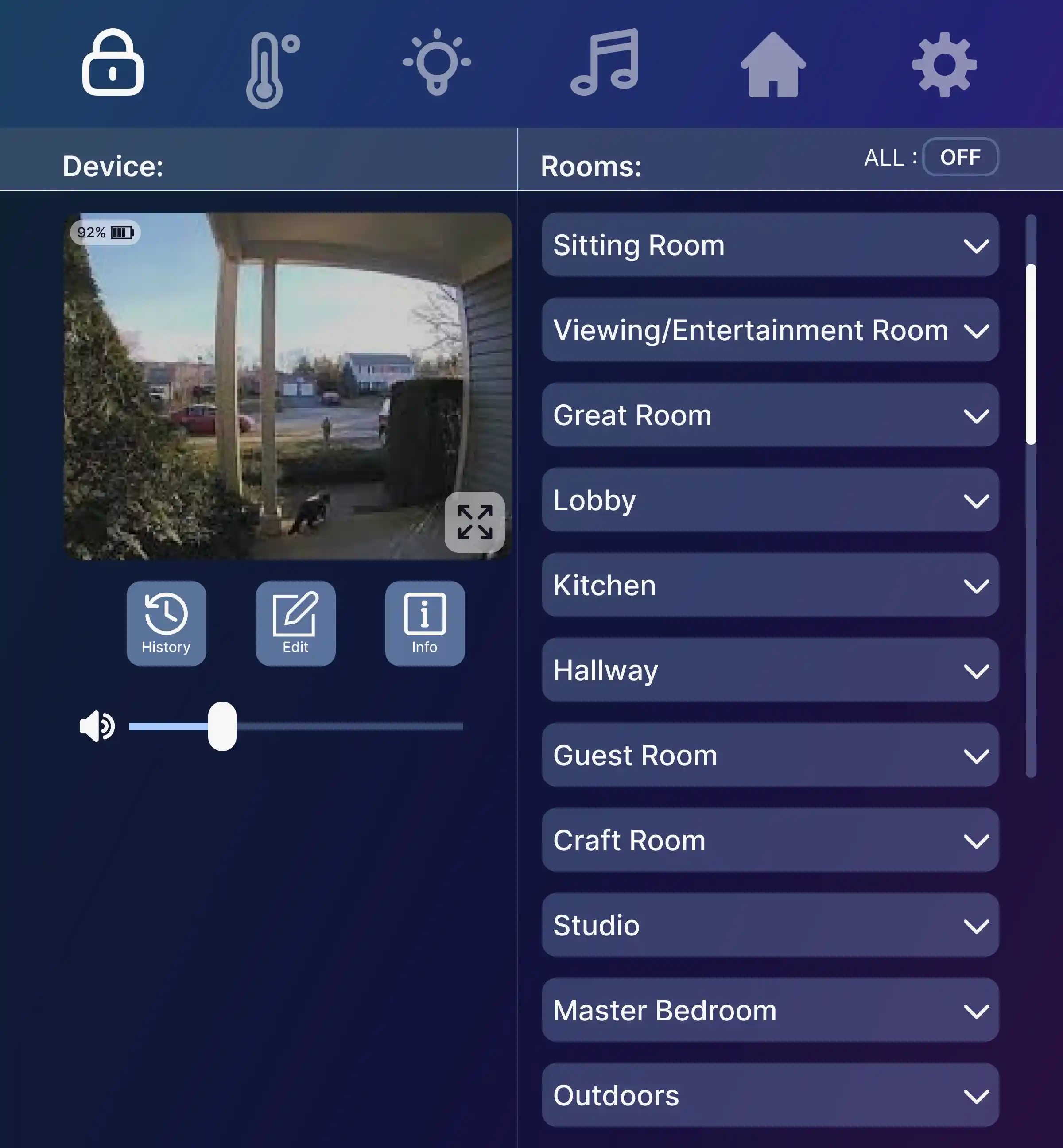
Because the device is a single wall-mounted device, I was constrained to only use a screen size of 1200 x 900 pixels (9” x 7” physically). I was required to integrate several screens into the system: a home screen, a light screen, a music screen, a thermostat, and a screen able to monitor surveillance cameras. My solution to this was to limit my main screens to only the required screen and have the dashboard split between the smart-home controls (on the left) and the list of data (on the right). The list of data is split into its respective rooms, with a dropdown able to access individual devices. The core concept here was to find a balance between having as much available upfront to lessen clicks, but not so much that the user ends up overwhelmed.
Sketches


First Pass


I initially only had a limited time to complete the project, a little over a week. The frames with the dark blue background (see below) were my initial “completed” design. However, after receiving feedback, I went back to the project to see if I could improve the layout. I eliminated the branding as that was not the goal and added no value; instead, I optimized for a simple color scheme that can be inverted into a dark mode version of the dashboard, which has more utility. I also cleaned up the spacing between elements, using IBM’s 2x grid, especially since it is provided for free for Figma as a component library. The process for this was interesting because of the amount of time passed between this project's initial completion and my later revision, of about two years. Despite my supervisors being satisfied with the first pass of the design, going back to revise has revealed to me how much I have grown as a designer; I was seeing errors and making more intuitive and informed choices than when I first completed this project. It's not often I get to experience my own progress as a designer because I still have much to learn, but this project was a delight in revealing how much I’ve grown and leaves me more excited to expand even more.
Final Pass